Anonymously share sneak peeks of what you've been working on, give & receive unbiased feedback and find inspiration from other designers. Upload mocks, icons, gifs or photos of whatever you've been up too. No sign ups, no logins, start sharing and exploring right away. Share the ingredients that make your designs so great. Dribbble. Show and tell for designers. Designer show and tell. Yik Yak for designers. Bounce off ideas with other designers. Experiment with new designs. Don't be afraid to fail.
Privacy
Support
About
Share your latest designs and find inspiration from other designers.
Go back
11y
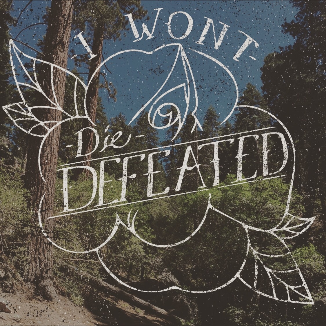
typography
Alfa
A little hard to read with all the noise
Bravo
The logo could be a lot brighter in comparison to the image which serves merely as a backdrop.
Charlie
The font design part is cool, but You need leave more margin
submit
2
Download the iOS app
Made in a dark corner