Go back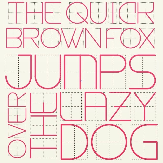
Alfa Cool font, the C is a little weird, but the rest look great.
Bravo ^ agreed
Charlie Ditto
Delta Ditch the serif on the C and you're there. Nice work!
Echo Thanks all! I'm working on lowercase now.
Foxtrot Looks good, but ditto on the C. And maybe have the W point going \ as opposed to / - just an idea, you've probably already tried it though
Golf ^ agreeing
Hotel C and W