Go back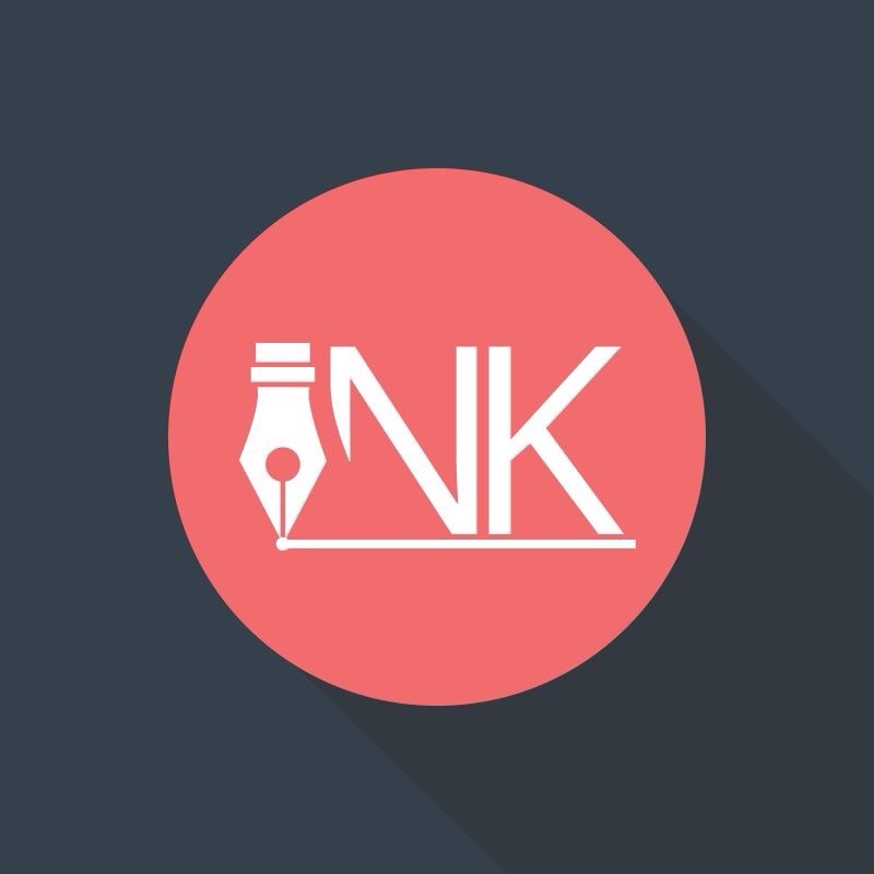
Alfa INK Branding Agency
Bravo Better
Charlie Way better!
Charlie Way better!
Echo It is an improvement. However it's still not a good logo.
Foxtrot I read NK. The pen logo takes the i away. Do something with the actual ink. Now i have the im pression it is about a ink pencil. Or in this case NK pincil.
Echo ^ yes. Also the reason why it is appealing to 'want to be graphic designers' right now is because of the color choice and the circle, the background and the shadow. Without wanting to be mean... Higher a graphic designer.
Echo I meant hire 😁
India I think it's great however, I did not know that it was supposed to read INK as I simply saw a pen and an NK.
Echo If you think it's great but have a problem reading ink, well then it is not great.
Foxtrot ^ agreed!
Lima 100% better than the previous iteration! Good work improving!
Echo So what is it? Are these initials of a person who uses a fountain pen?
November I saw it's ink! I love it
Alfa If you have read the first comment you would know for what this logo stands, also thanks for the incoming critics! Some were really helpfull!
Alfa Comment*
Echo I did see the first comment. However a logo is suppose to explain itself. What is the comanies service and name should be answered by its logo. Company logos like nike don't have to worry about that part anymore.
Romeo I disagree, everything in a company is not necessarilly found in a single logo, a logo is just a little part of a company that gives a hint about what it does or what it stands for.
Romeo In this case, a pen, though superficial, is a great start, might work actually, but just fix the shapes to make it seem more like an I and play around with the lines and spacing of the N and the K, N is too wide.
Echo The name should be clear thou... Or are you disagreeing on that as well?
Uniform I'm a graphic designer and I read INK right away. Maybe if you don't know a calligraphy pen nib looks like it wouldn't be as clear though.
Echo I'm a graphic designer as well. Good for you that YOU can read ink righ away. I can't, even though i know how pens look like. But whatever bad design wins too often.
Echo Also... What i find hilarious, this is a branding agency logo and he/she has such a hard time designing a well-designed logo.
Alfa Well I guesse that's normal! I wanned to have a perfect logo! And I tried lang times restarted on different bases! Looking for inspiration! Even if I thought this was the right one, i just restarted! To see what progress
Alfa I make during the development of my logo...
Echo You definitively improved don't get me wrong.:) im sure you will end up with a good logo if you work hard. If you want to help companies with their branding needs you have to get there faster thou otherwise you are going..
Echo ... To write red numbers. That im sure is not your goal.
Nada I read ink straight away. I like it :) it would be cool to see lots of color variations . I feel the circle drop shadow needn't be there . If it were me I'd concentrate on the Letter and graphic element .Go for it !!!