Go back
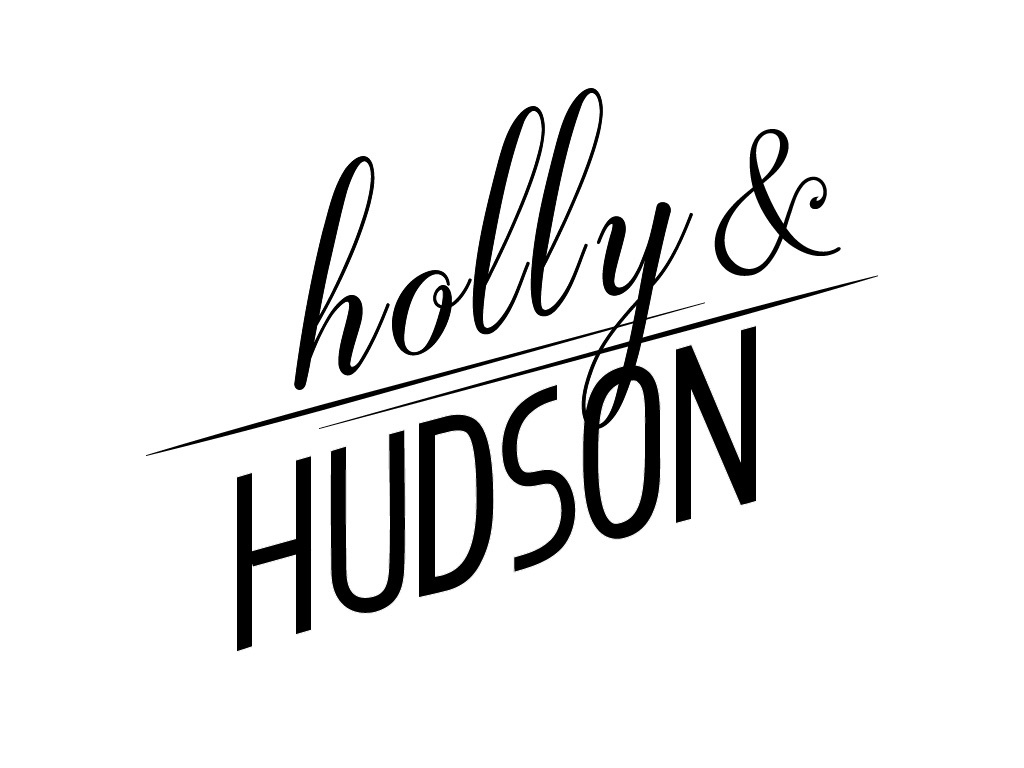
Alfa For a salon/barbershop that has services for both men and women. I feel it's almost there but something is off or missing. Feedback?
Bravo Hudson feels a little big. Maybe use the & as the divider instead of the lines.
Charlie Well i see the female and male thing. So that's good. You understand the general idea of typography. However the layout is grade d. You didnt spend any time to think about hierarchy, kerning, contrast.
Delta Ok, the male and female thing is a good concept. The execution is off and not refined. It's very 'bitty' for a logo.
Echo There is to much spacing between the letters in holly. Why is the Y going true the O in hudson? It is for your discription that is for a salon/ barbershop otherwise i would not have known that it was for a barbershop.