Go back
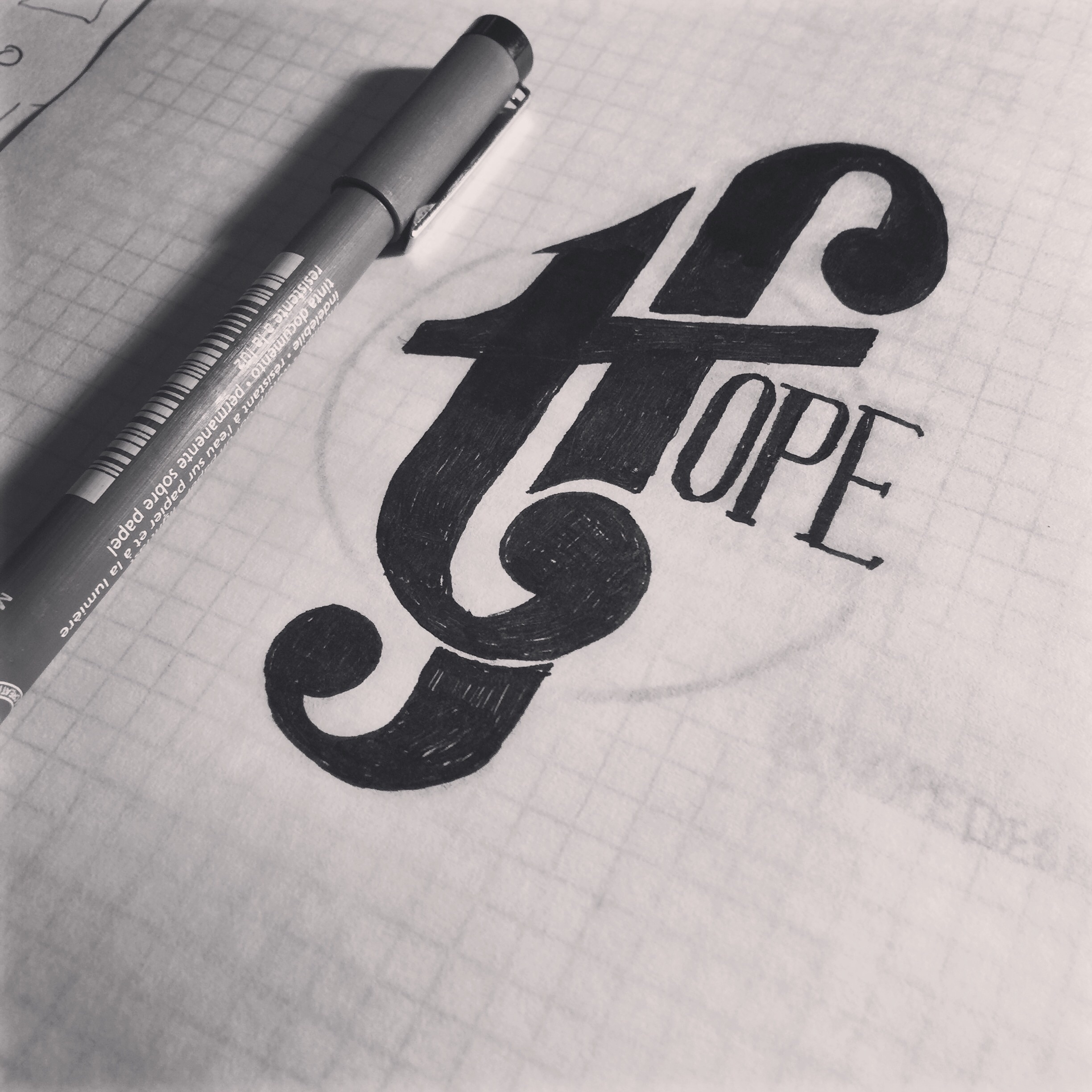
Alfa Cool, I'd kill the bottom tail else it kinda looks like t f
Bravo Indeed. I read 'tfope'.
Charlie What else is it supposed to read?
Bravo Hope :)
Charlie Oh my. I'm sorry, not identified at all.
Foxtrot This needs work; it definitely doesn't read hope. Can't you see the 't' clearly?
Golf My initials are TF. Make more sense now?
Alfa I'd still lose the bottom of the f
Foxtrot Well it might have helped if that was explained! I still don't think 'tf' can be forced into this design like this; I'd come up with a monogram without the word hope, or go for another approach.
Juliett The tf on its own is awesome. I'd love to see it vectored up.
Foxtrot ^agreed. Don't force Hope
Lima Why do you want it to have your initials and hope? Is it a personal logo or something? The TF makes a great logo with or without the bottom of the f
Golf Just trying something different. Rebranding my site and my logo. It will be vectored this week. 👍🏼
November I agree with the comments above. Tf is awesome tho
Oscar For some reason my brain read it Hope, and then I began to see the big letters, so for me, it worked at first sight. I like
Charlie ^ good for you.:) you are one of a few who see the word hope first.
Quebec T Fope?