Go back
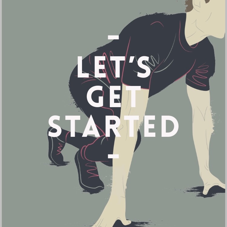
Alfa Illustration for magazine spread on new sports development
Bravo Good start. maybe add shadows? The thumbs look off
Charlie Quite like it, especially the textural roughness around the edges
Delta I agree with the thumb comment. One looks like it's broken.
Echo I love the use of the colour lining through the clothing. I think the thumb on the closest hand is a good shape, perhaps the nail needs adjusting to make it look more natural, and same for the other nail
Foxtrot Beautiful color palette! It could benefit from increased contrast between the image and text. You might also explore varying the line thickness. The looseness and fluidity of the lines helps show movement well.