Go back
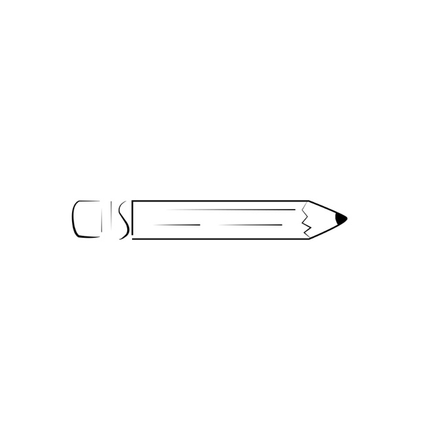
Alfa Reminds me too much of clip art. Im sorry.
Bravo Ya not a big fan of the varying line weight here. Seems unfinished.
Charlie Might work in context of a wider style, but on its own, nothing.
Delta Review your synectic triggers and apply them. Use 1 or a combination and develop something unique. Keep it up. Graphic design is not for the faint of heart. It requires a lot of practice to see connections between shapes
Echo lose the fades and it'd be pretty good
Foxtrot Whoever said 'synectic triggers' comment above needs to come back to earth - no one knows what you're talking about serzly. As for the pencil clip art artwork, it sucks. Too many disconnected lines, fades and sharp edges.
Golf This is "my" logo. The first sketch
Foxtrot Well this 'logo' sucks. There's way too much detail.
India Needs more synetic triggers. Apply the 'synetic trigger' filter in Photoshop and you're there.
Foxtrot Needs more 'syntactic flux capacitor' triggers. Apply the 'syntactic flux capacitor' trigger in Photoshop and you're there.