Go back
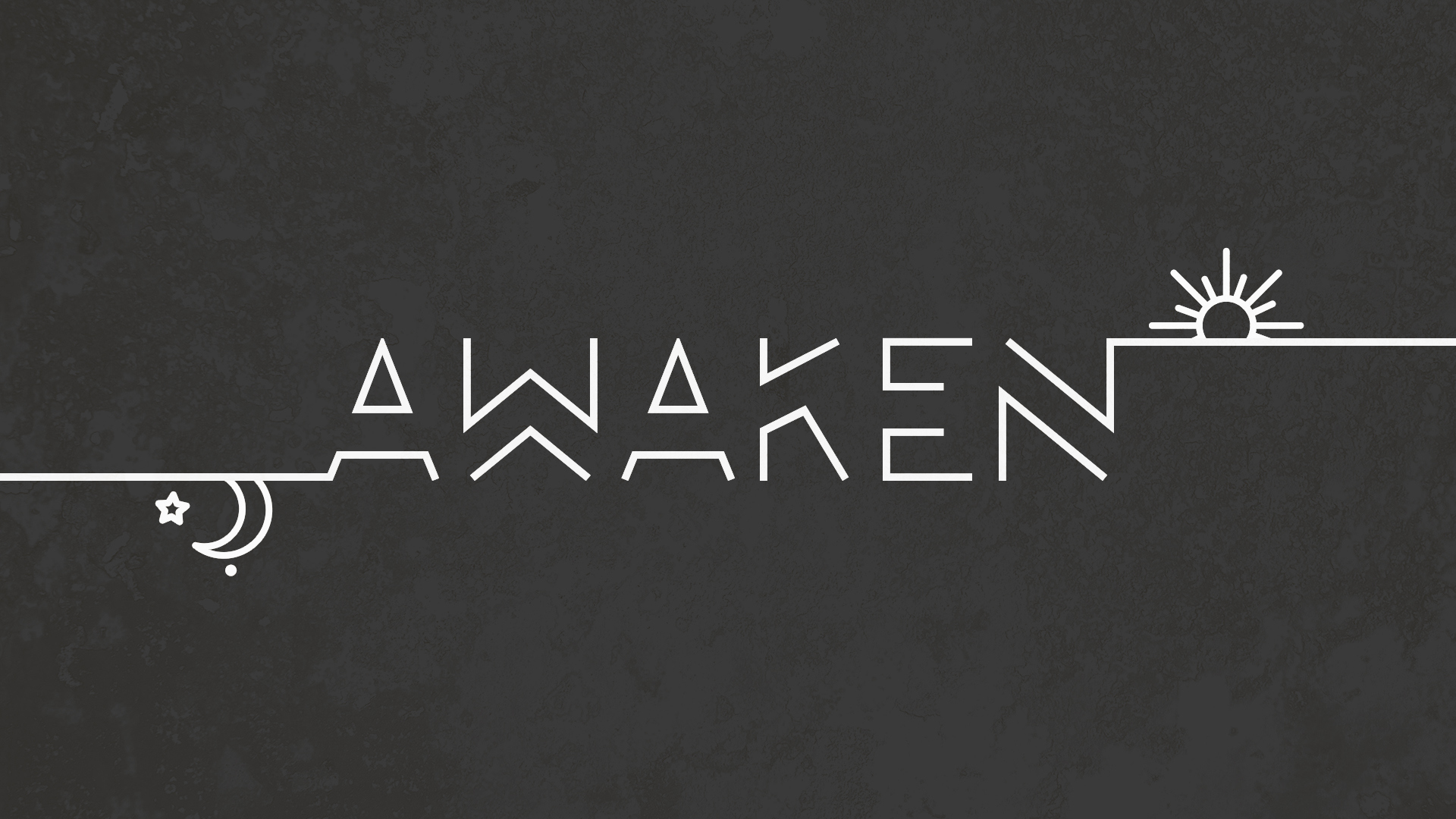
Alfa Cool concept, execution could use some work.
Bravo A breath of fresh air! Thank you. And i do agree with alfa.
Charlie Nice, but alpha and bravo are right. Maybe you could try sharpening the ends of the strokes to consistent angles, rather than having them all end in a flat rectangle. Does that make sense?
Delta This is good. Don't think it needs much more work personally. Make it into a full typeface!
Echo This is a full typeface. http://www.1001fonts.com/lombok-font.html