Go back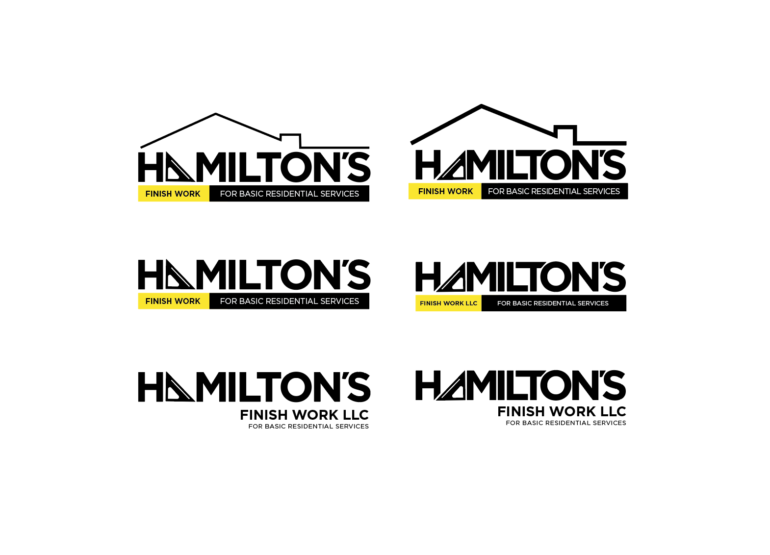
Alfa Working on a logo for a general contractor. These are variations on the design he was leaning toawards. Any input would be greatly appreciated! His taste isn't as progressive as mine, but I gotta make him happy!
Bravo Middle right. The top once are no good.;) reminds me too much on realtors. Plus a roof and a ruler is overkill. I wish you luck and stay strong, let him know that you are the designer and he is the contractor.💪
Charlie Always a battle! But to make a good living sometimes you have to choose your battles! I appreciate the input.
Delta top right without the roof
Echo Middle right looks clean and professional, but not too bland as to be generic. I'd align the right of the yellow box to the right side of the M. Also make sure you have a version that works in black and white (perhaps use a white/empty box with a black outline to replace the yellow box?).
Charlie Thanks for the feedback! Lots of great input. I just got a little too close to it.
Foxtrot My pick: Bottom right