Go back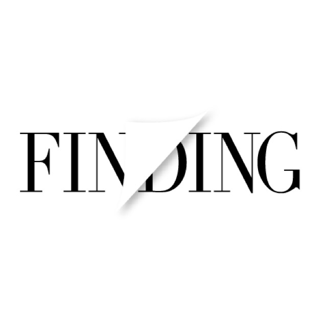
Alfa For my assignment I'm designing a logo for a book store/cafe named Finding, I would really like feedback on this, thank you!
Bravo The half page thing doesn't work, maybe do like a slant cut of the last couple letters or something. Or maybe half bold have regular weight.
Alfa Do think maybe I should place the folded page elsewhere?
Alfa Thank you by the way for your feedback!
Bravo I'd try on the end, but logos should have drop shadows
Alfa I put a drop shadow on the page flip to give it more emphasis, maybe doing the ing in an italic style?
Bravo You just have to iterate more.
Charlie At first I read "ending", then "fin" (French for ending).. I thought it's good but then I recognized that this is not intended.
Delta Lose the page curl it's cliche and cheapens what could potentially look modern and fresh. A simple diagonal line would suffice - get rid of the shadow but still 'mask' out the White.
Echo Ditto on last comment