Go back

Alfa Is that an actual place? Shape is super rough
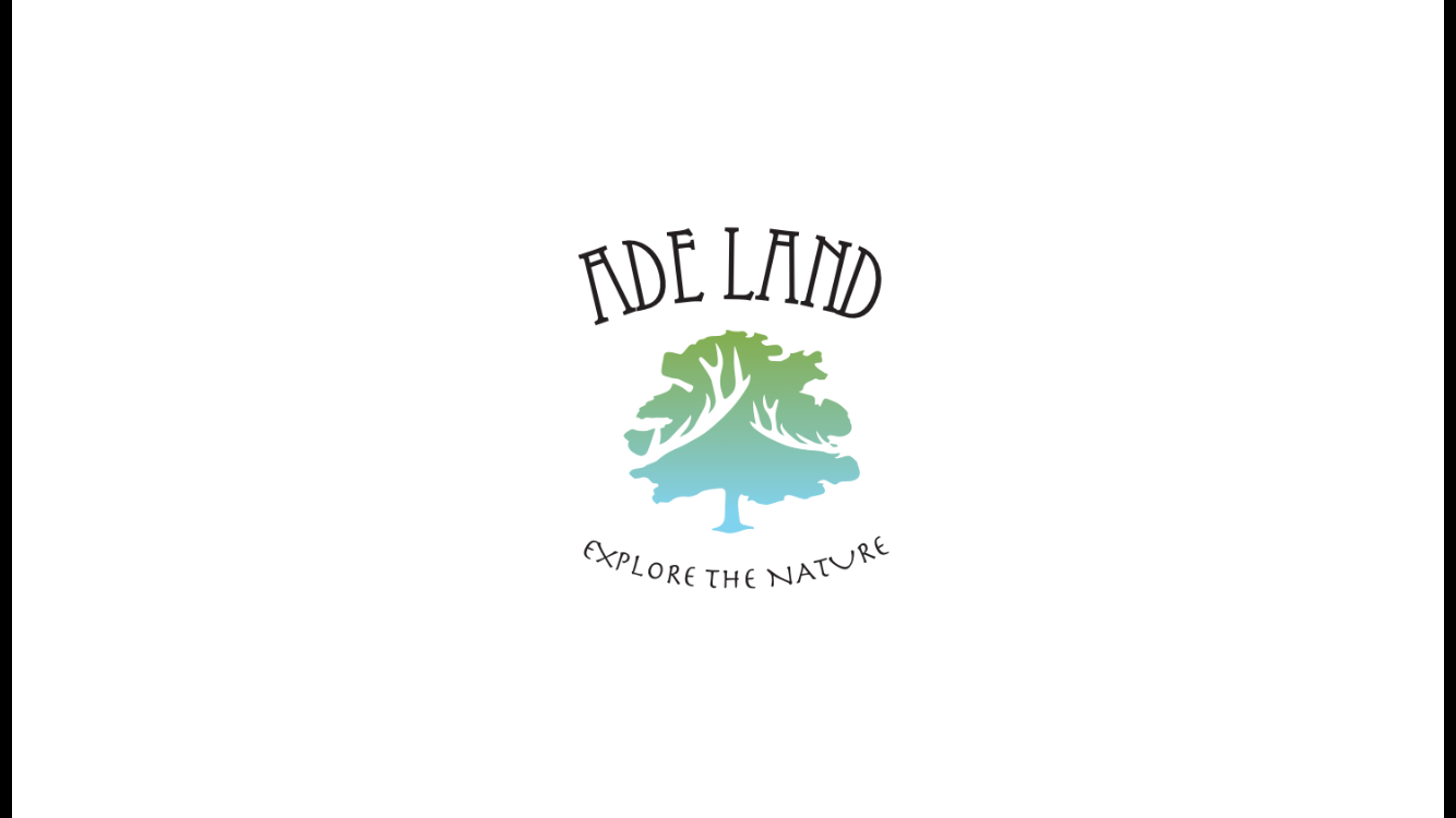
Bravo Tree with antlers, yes? I think if it's a logo, the shapes can be simplified a lot more and still have the same idea. Might be more powerful and quicker/easier to understand. It looks more livetraced than purposefully designed, to me. Also feels a bit off center from the words.
Charlie I would not use this degrade, also the "e" and the "x" are too close
Delta Not a fan of the secondary typeface, too kitchy/free-font-esque
Echo Looks like clip art bet rid of gradient and simplify tree line
Foxtrot The secondary typeface reminds me of papyrus.