Go back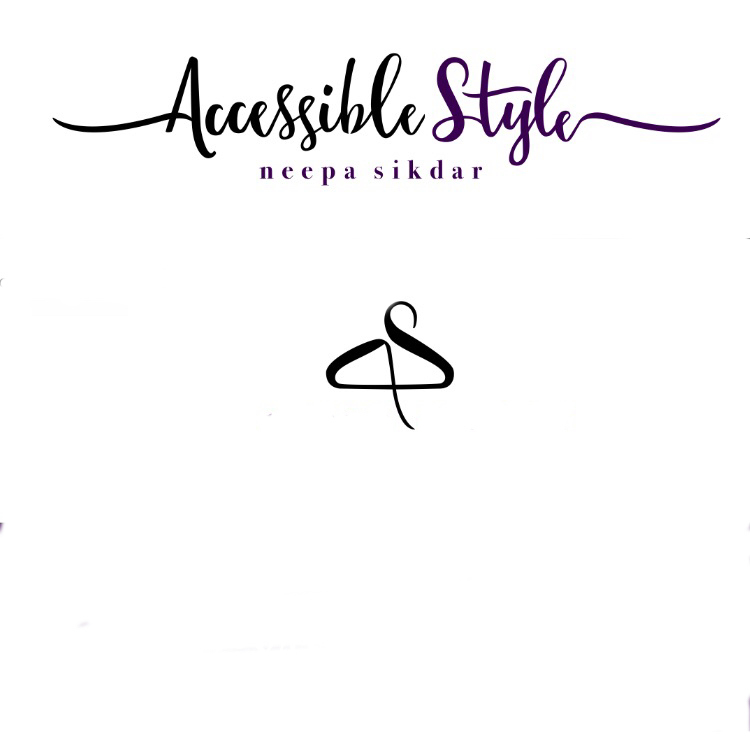
Alfa Whoever said I should use cosmic sans. Tell me what font I used here
Bravo Still not a good one
Alfa It's great to see how supportive you are bravo.
Charlie The symbol is a smart solution. I see the a and s and the hanger. Thumb up. The secondary typface doesn't work that well, a san serif would be better due to the small size and it works better with the main typeface.
Alfa Thank you Charlie for constructive crit. Verry much welcomed. Client requested that specific serif font. I tried play fair too like someone else suggested but she wanted it like this. Should I tighten the keening or open up and increase size?
Alfa *kerning. (Auto correct)
Charlie Well if that is the case then i think you did your best. Only little tweaking maybe... Position of the symbol is off and maybe play a bit more around with the symbol to better match the font on top?