Go back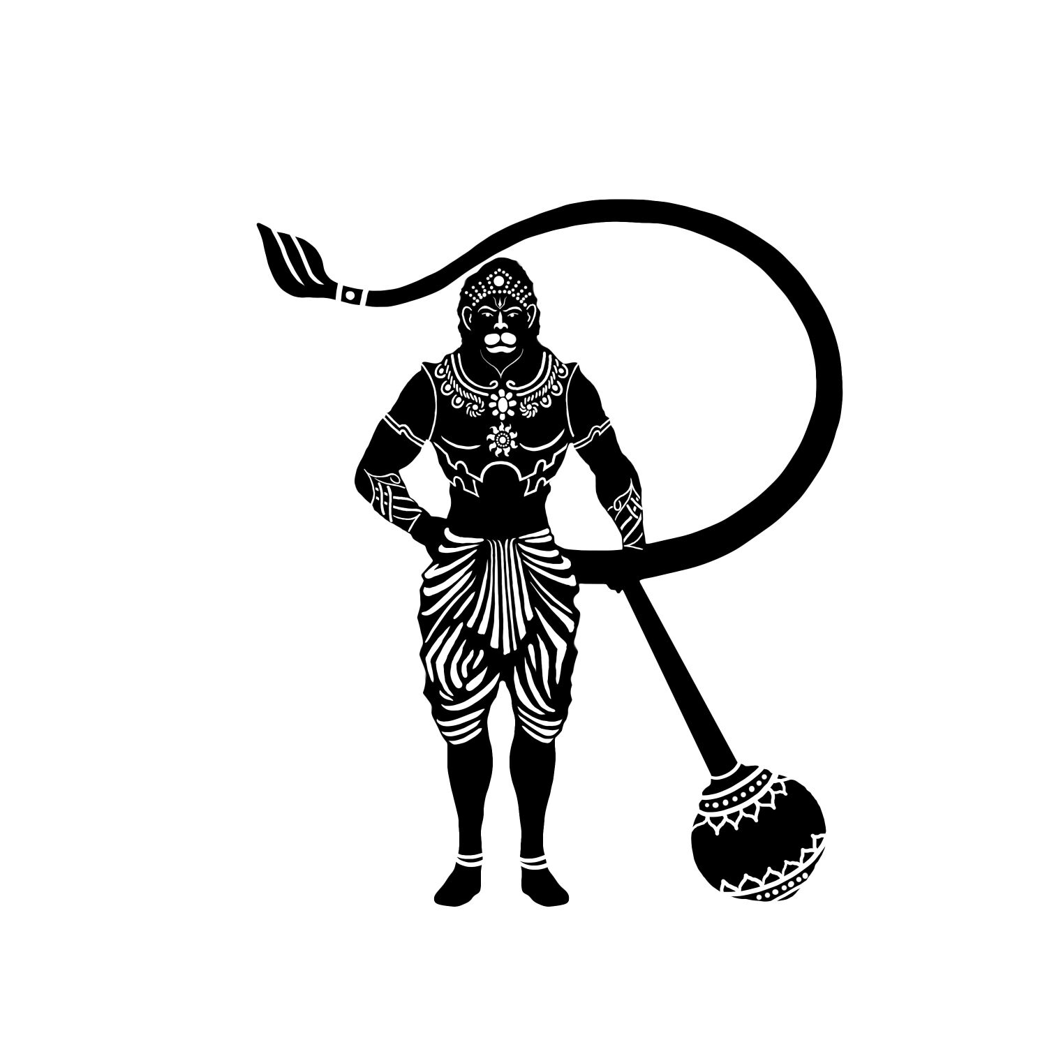
Alfa Even though it is so nice to see such detailed clean work and I totally appropriate that there are a few little things that bothers my eye... The tail and the 'instrument' look like they where pasted on, due to their proportions. The tail and head are too close together. By playing around with the size and repositioning i know it will be beautiful.
Bravo I agree with alfa. The main character is beautiful though
Charlie How does this logo work at a small scale ? You may need to create a simplified version as many of those fine details would be lost.