Go back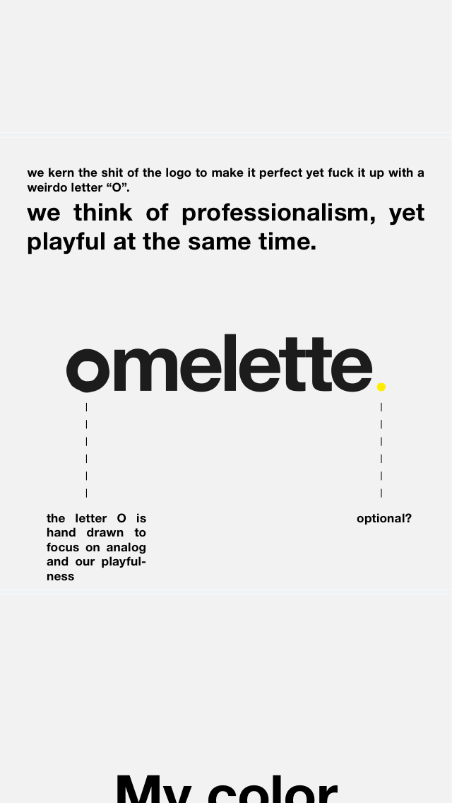
Alfa What do you guys think?
Bravo The o is weird without the explanation and the T's don't quite touch.
Charlie I don't understand
Delta I think you either need to make that O more obvious or don't do it. It's just enough that it kinda throws it off.
Delta Just make that O an egg, sunny side up! We're all thinkin it...just do it. Lol
Echo Yes what delta said. Make it more obvious. Make the whitespace in the o smaller and move it more of the center. I enjoy the concept and feel really stupid for needing deltas comment to get it.
Foxtrot how about fill up the white space in the o? then it looks like an omelette, but i don't know if that's what you would like too. Just an Idea. All though i like it ! :)
Golf Not a fan of the O, if you hadn't put the description I would've just thought it was poorly designed.