Go back

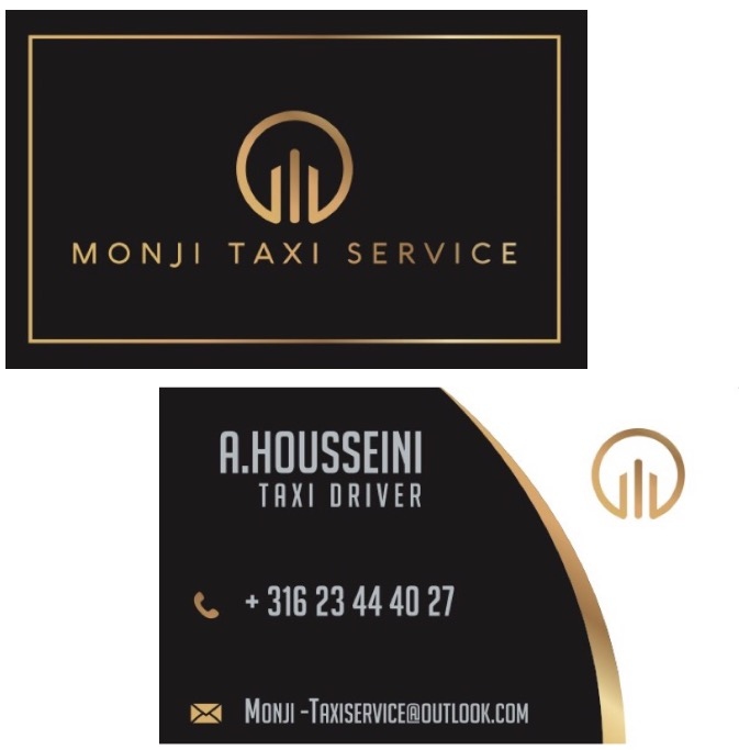
Alfa It's very flashy, maybe have one sides be fancy and then keep the other side simple with easy to read info
Bravo I don't think the font on the back goes well with the logo font. None of it seems to be aligned correctly either. I really like the front though
Charlie I second Bravo. The front is off to a nice start. The second font doesn't work. Perhaps use the same sans serif but not in all caps on the back?