Go back

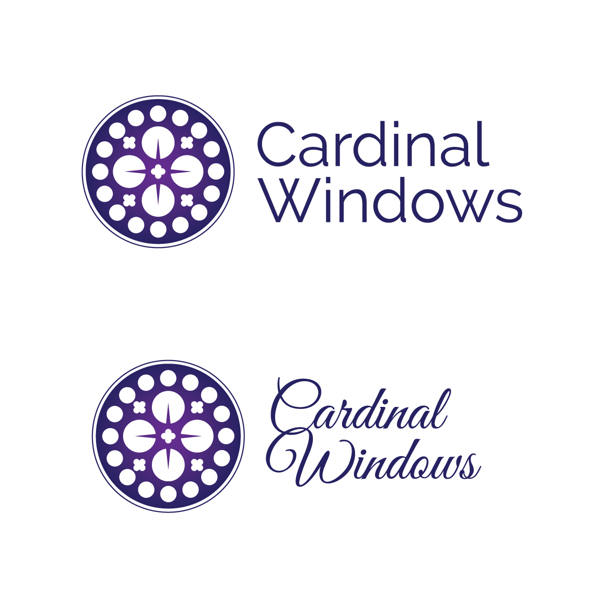
Alfa There's a couple of extremes here, what do we think is more like the right way to go typeface-wise?
Bravo Not a big fan of the gradient.. I like the sans serif typeface
Charlie Either works well
Delta I think the sans serif fits the aesthetic of the mark better. Plus legibility at small sizes might be a problem for the script.
Alfa I was also concerned about the legibility
Echo I know it sounds difficult, but a merge of them would fit the icon the best.
Foxtrot Too messy. Make it simpler.