Go back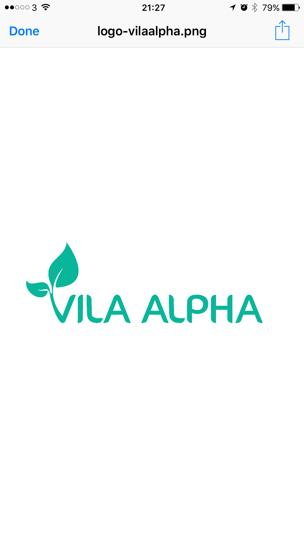
Alfa What you guys think? Its a school with strong care for the nature
Bravo It's cute, maybe more subtle on the Points at the end of the letters
Alfa Good call! I want to feel the logo more organic too. Any tips?
Charlie Probably then go for more of a script font. Or make the A's more like the V.
Delta Love this! I would make the letters a bit softer though to match the V as the A's are a bit harsh :)
Alfa And the P and L?
Bravo The L and P are probably okay as is
Echo Remove the leafs and focus on the letters. It'll be beautiful
Foxtrot I feel each letter is trying to do too much, needs less curves to read as a word rather than single letters? If you get that!
Golf This looks good!