Go back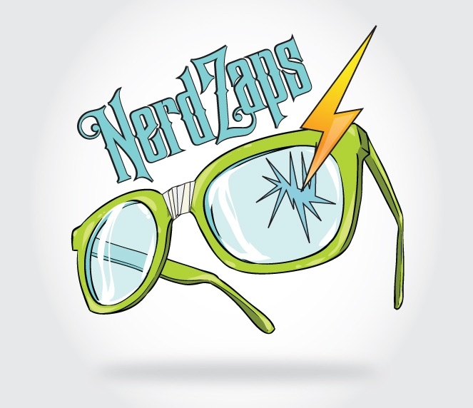
Alfa The font doesn't really fit the glasses
Bravo It's a tattoo blog. So it fits the theme.
Charlie I agree about the font. Needs to look more hand drawn
Delta I think the perspective of the glasses vs the word makes it feel a little bit odd, an extrange tension
Echo The text doesn't seem to fit with the angle of the glasses. I do enjoy the color pallet though.
Foxtrot The text needs more of a hand drawn look