Go back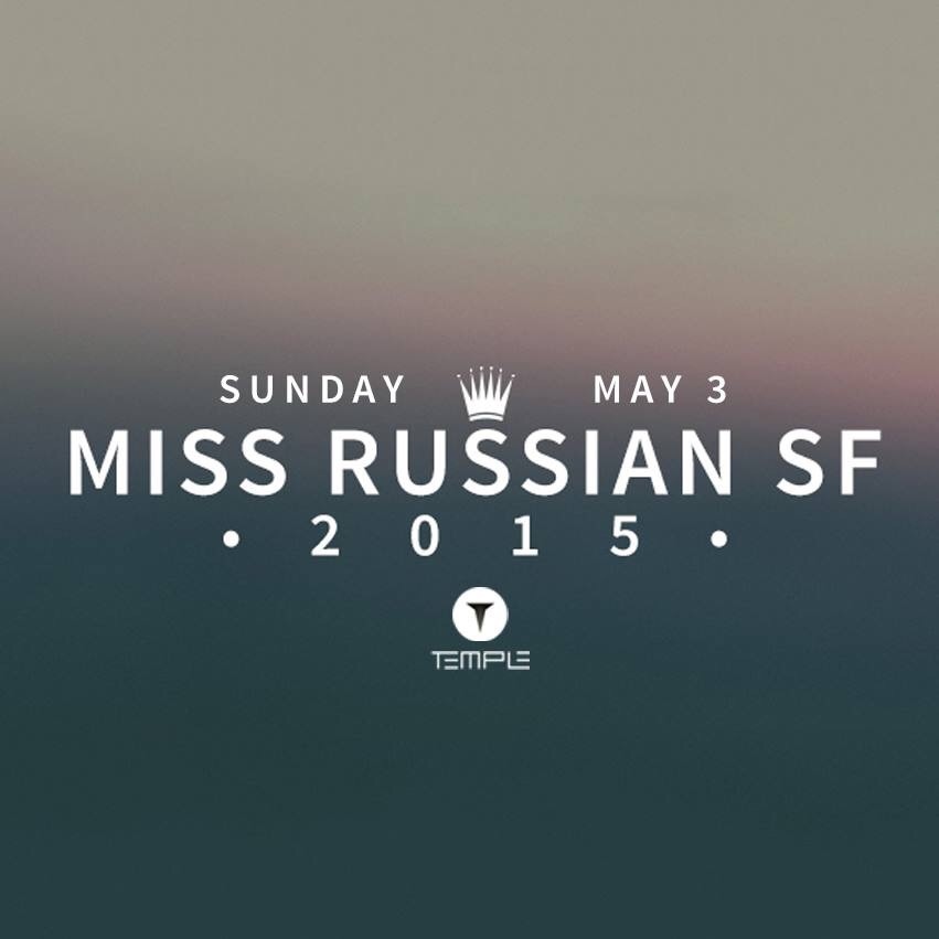
Alfa Nice colours, generic type treatment
Bravo Love the good use of type and spacing!
Charlie I feel like it needs more hierarchy. You don't really have much to differentiate the typographical elements.
Delta I agree- hierarchy is lacking.
Echo The line spacing feels way too tight and inconsistent
Delta Crown and temple aren't aligned
Golf You're right, they're not aligned because the "s" is not centered.
Hotel Maybe the background could be a pattern or texture that represents Russian royalty or some rich, luxurious textiles...
Echo Adjust the letters pacing so the S isn entered. Don't just type letters. Design.
Echo ^^is cantered*
Echo Centered. \sigh