Go back
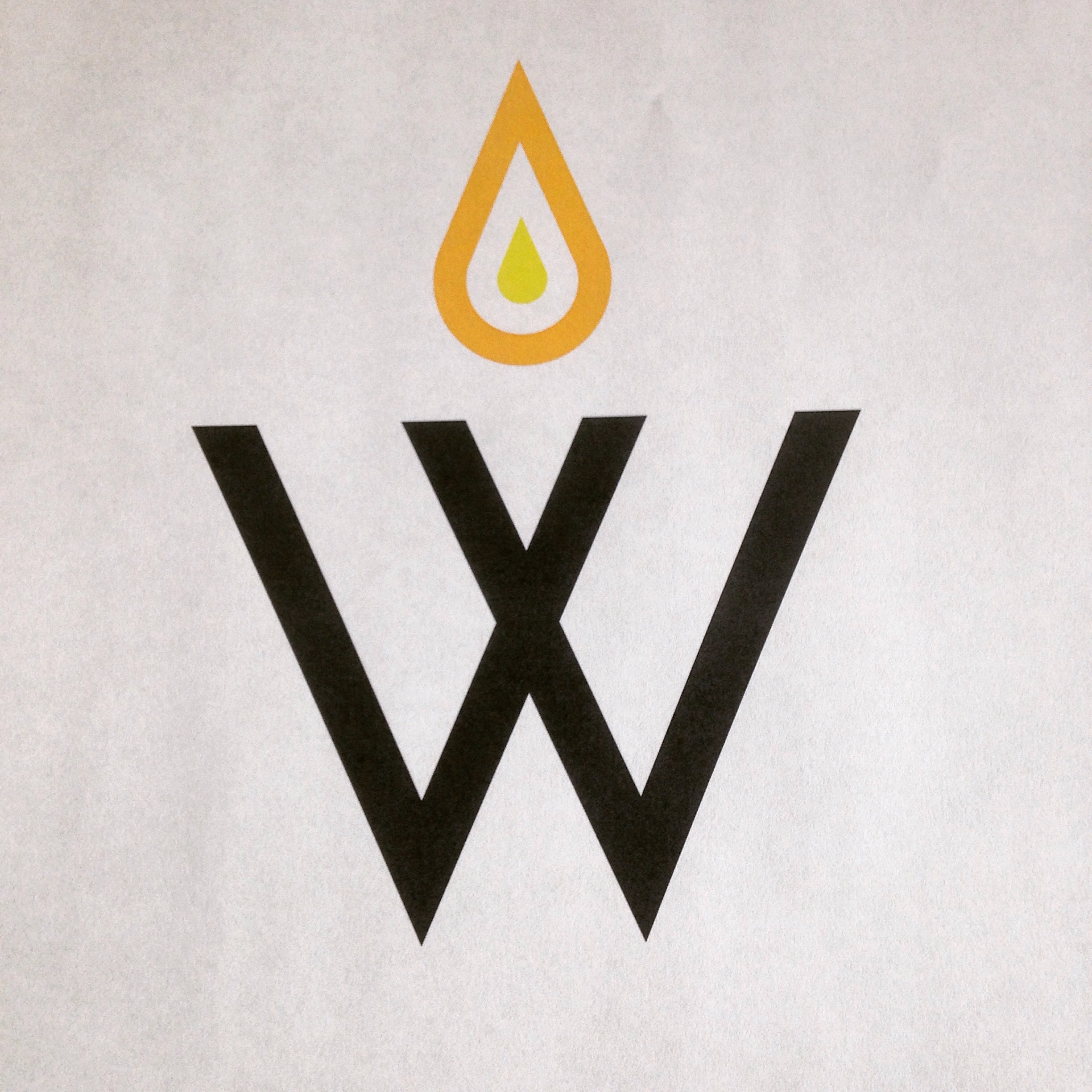
Alfa Feels like two separate logos
Bravo I agree- something has to flow. And the hierarchy is weird
Charlie I think the droplet would look better under the "W".
Delta The line weight on the droplet should match the W, it's a problem at that size but it'd unite the design more
Delta Is it a droplet or a flame?