Go back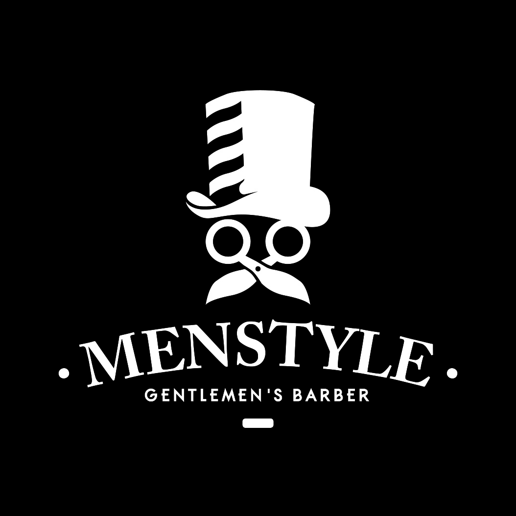
Alfa I'd match the lines to the curve of the hat better
Bravo You've done it way better, but it's still pretty derivative:
Bravo http://hmessages.blogspot.com/2012/02/this-here-is-logo-for-barbershop-shop.html?m=1
Alfa This one is a lot better
Echo Every logo is derivative, I don't know what your point is.
Foxtrot Kinda a huge hack from mister cutts barber shop...
Alfa So you're saying cause you found one example, that's probably not even the first, no one else can do anything similar?
Hotel Menstyle needs a little kerning.
Bravo Every logo is derivative sure. There is no original. Sure. But directly ripping a concept and adding a hat is a little much- that's like having a computer company use an apple logo with two bites out of it. Cmon.
Juliett Must not be a good barber if even the logo is wearing a hat. :P
Kilo The logo is derived from the original which is a man wearing a top hat. He also had a monocle and was dressed in a tailored suit. It existed for 30 years but did not scale down too well due to the detail and key lines.
Kilo The general message of the old logo may have been confusing to a new audience of customers as it might have been seen to be a tailors.
Kilo These points have been considered in the new design which is why the scissors and barbers pole have been introduced with a more simplified and bold style.
November Great
Oscar Gooood
Papa The letters are way too close together you should optically align them. I would consider a different bottom typeface, the G is hard to read that small.