Go back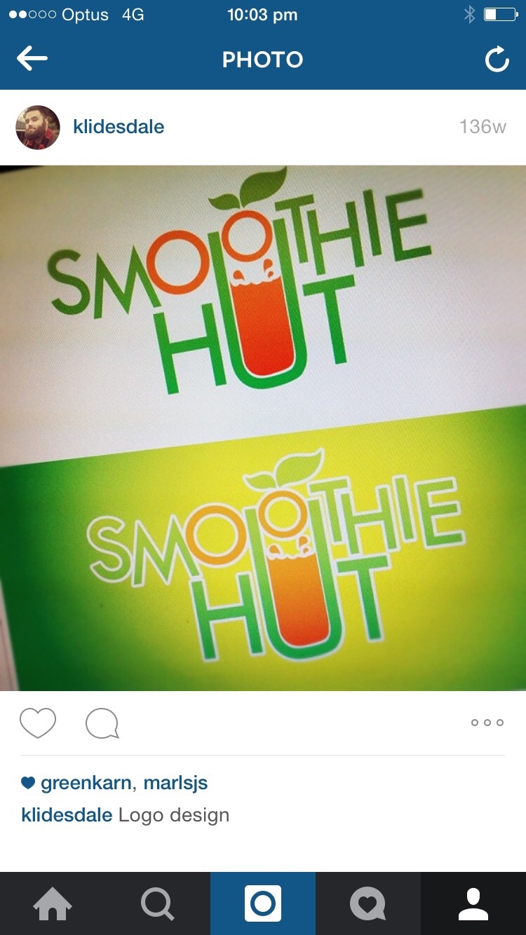
Alfa the 'u' probably doesn't need to go so high.
Bravo I like the concept but there's a lot to take in for a logo. Would also even out the keening.
Charlie It's cool. Too many concepts happening at once though. Pick either the leaf and the uneven baseline, or the cup "U" and uneven baseline.